
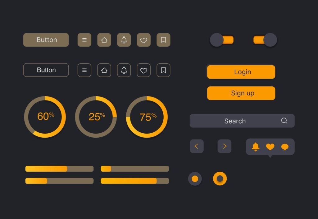
Users do not read your website like they are reading a book but instead scan through it, evaluate it quickly, and form an opinion of it almost immediately. According to research, the average user will determine if they want to stay on your site or leave before they have even read the entire content of your website; therefore, your website’s user interface is more than just the visual layer; it is the first impression of your business, the salesperson for your business, and the trust builder for your business all in one.
The goal of a high-converting website user interface is not to create an over-the-top or elaborately designed website but to create a website user interface that provides a user with simple and easy-to-follow directions and guidance in order to fully understand your business offerings and, as a result, gives them the confidence to take action.
Clarity is the top priority in creating a high-converting user interface. Once a user gets to a website, they need to know right away what kind of business that website represents. If a user is confused about what a business does even from one second, there is a much greater chance that they will leave the site entirely rather than
A good website always has clear flows of information. The primary piece of information is stated first, with a brief explanation of the message and clear next steps for what the user should do. The entire site’s structure should resemble a single smooth path, rather than information spread out over many areas.
If everything is clear to the user, they do not have to use as much thought, and users with less need for thought will typically stay and explore further away and further away from the site.
A well-organised website UI creates a visual flow of movement through the various parts of your site. When people look at your website, they will not read every word; rather, they will scan the headings, measure the size of the white space, and pay attention to things that are highlighted.
Because of this reason, the way you arrange the content has a direct impact on how easily users move around the page. If the page is well-organised and the information is separated by appropriately sized spaces, the user will feel at ease as they move through the content. If the information is all crammed together, or very randomly placed, the user will become confused and leave your site early.
When the visual flow is done correctly, it feels similar to reading a story. It moves seamlessly from the user’s understanding of the problem to the user finding a solution.
The speed of your site will have a huge effect on your conversion rate, no matter how good it looks; if your site takes too long to load, you will be losing visitors. Due to the way we access our information today, we all expect it to be instant – every fractional second that it takes your site to load will reduce the likelihood of someone reading through your entire webpage or converting into a potential customer.
A website that loads quickly does so in an efficient manner and builds confidence and trust in users using your website. If a user ends up on a slow-loading site, they are left doubting the business behind the site, regardless of whether the business itself is trustworthy.
Performance isn’t only a matter of technology – it plays an integral role in the success of how the website will be experienced by end-users and whether they will convert.
As mobile browsing continues to increase, it is more important than ever that you design your website for smaller screens (more than just designing for desktop). You need to ensure your interface is considered mobile-friendly so that your users can read your content, tap on buttons without difficulty and have your pages adjust for their screen size automatically. Users will lose interest in your site if they have to zoom in to read and/or have difficulty tapping on items.
A smooth mobile experience eliminates friction in the process of using and interacting with your site, which increases the likelihood that the user will convert.
A high-converting website will consistently provide the end-user with clear instructions as to what they should be doing next on the site. If you do not provide specific instructions on how to proceed once the user has finished reading the page, then you may find that the user reads the page but chooses not to take any further action… e.g., contacting the business, requesting service information, etc. When the user understands what they must do in order to contact the business, they will more easily follow through with that action.
A well-designed UI will provide a gentler method of leading users towards taking their desired action; it will lead them to action without forcing them to take action.
Users will not convert regardless of the quality of your website because they have an inherent lack of trust. Trust can be established through design and content working together in unison. A professional design interface, legitimate business details, and clearly presented content create an overall environment in which users feel safe when viewing your website. Users are more inclined to take action if they see a business that is transparent and has current activities.
When it comes to deciding whether an interested visitor becomes a customer, trust plays a huge role.
It directs a user through his or her journey and acts as an online map for the users of the website. If a user cannot quickly find what he or she is looking for, patience usually runs out.
An intuitive navigation system makes even the most complex sites fast and easy to explore. No user should ever have the feeling of being lost while participating in exploring your website. The feeling of being in control tends to keep them in one place interacting longer.
Easy navigation results in relieved frustrations and improved citizen experiences.
A website with consistent elements creates a stable and professional-feeling experience for the user, which is essential to increasing conversions. When all aspects of design (colours, fonts, spacing, and design patterns) are the same across all pages, users feel as though the website has been created with the same care. If frequently changing or random elements of design disrupt the user experience, the user’s level of trust decreases along with their willingness to convert.
Building familiarity through a consistent UI creates confidence for the user, thereby increasing the likelihood that they will convert.
A high-converting website UI is not about adding more design elements; it is about removing confusion. It is about making things so simple that users don’t have to think twice before taking action.
When clarity, speed, trust, and structure come together, a website stops being just a digital presence and becomes a powerful business tool that drives real results.
So now think about your own website. Is it simply showing information, or is it actually guiding users toward action?
If you want a website that is not just visually appealing but also designed to convert visitors into real business leads with strong UI and UX strategy, you can connect with us.
Diama Technologies
46, Rabindra Nagar Market, Durgapur – 713206
contact@diamatechnologies.com
+91 89007 69311